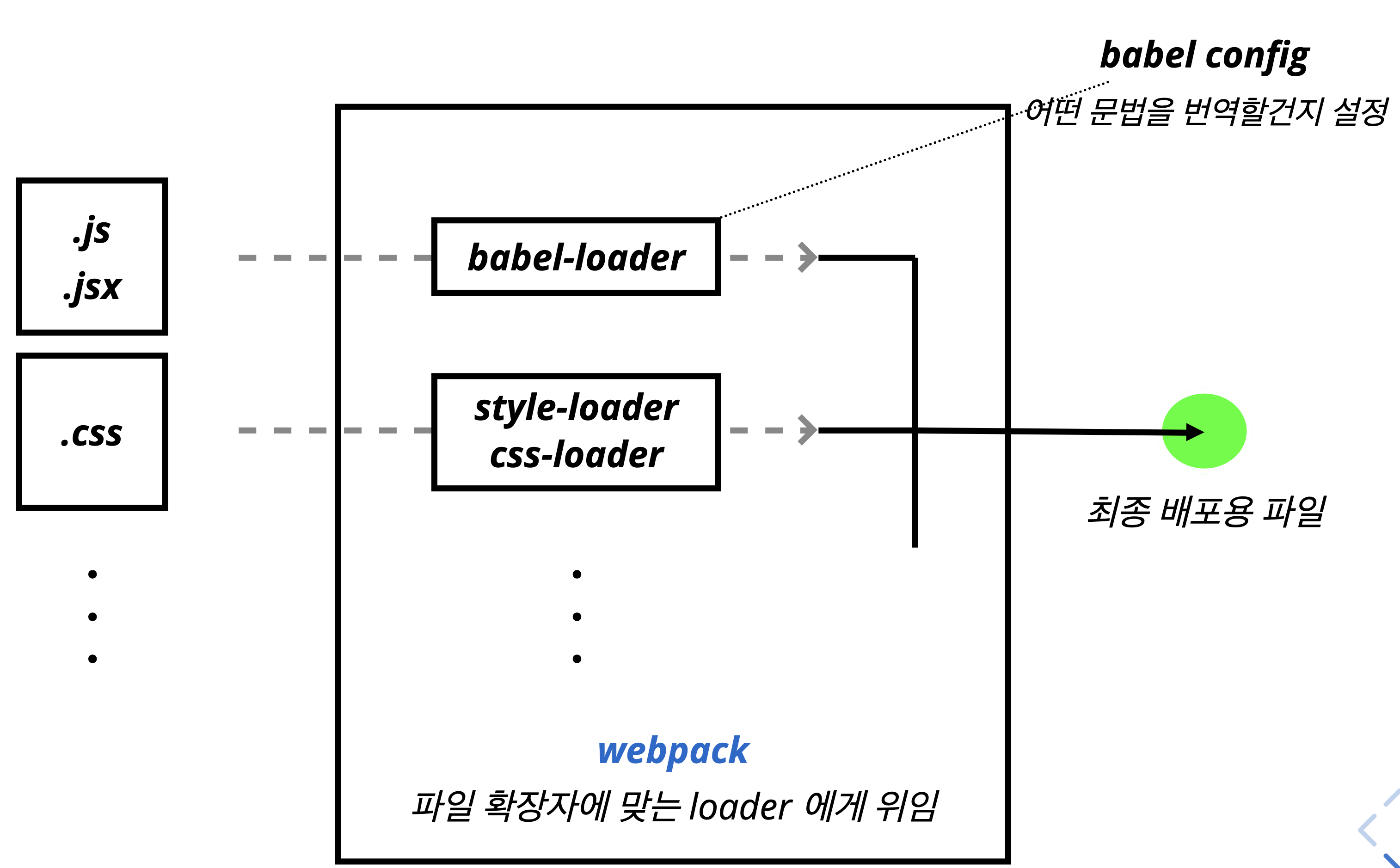
Style Loaders
실습
npx create-react-app style-loaders-example

cd style-loaders-example
# Webpack 설정을 참고하기 위해서 eject를 하는 것
npm run eject
CSS (webpack.config.js)
// style files regexes
const cssRegex = /\.css$/;
const cssModuleRegex = /\.module\.css$/;
const sassRegex = /\.(scss | sass)$/;
const sassModuleRegex = /\.module\.(scss | sass)$/;

...

{
	test: cssRegex, // /\.css$/
	exclude: cssModuleRegex, // /\.module\.css$/
	use: getStyleLoaders({
		importLoaders: 1,
		sourceMap: isEnvProduction && shouldUseSourceMap,
		}),
		// Don't consider CSS imports dead code even if the
		// containing package claims to have no side effects.
		// Remove this when webpack adds a warning or an error for this.
		// See https://github.com/webpack/webpack/issues/6571
	sideEffects: true,
},
사용
import './App.css';
CSS Module
...
            // Adds support for CSS Modules (https://github.com/css-modules/css-modules)
            // using the extension .module.css
            {
              test: cssModuleRegex, // /\.module\.css$/
              use: getStyleLoaders({
                importLoaders: 1,
                sourceMap: isEnvProduction && shouldUseSourceMap,
                modules: true,
                getLocalIdent: getCSSModuleLocalIdent,
              }),
            },
...
사용
import styles from './App.module.css';
Sass
            // Opt-in support for SASS (using .scss or .sass extensions).
            // By default we support SASS Modules with the
            // extensions .module.scss or .module.sass
            {
              test: sassRegex, // /\.(scss|sass)$/
              exclude: sassModuleRegex, // /\.module\.(scss|sass)$/
              use: getStyleLoaders(
                {
                  importLoaders: 2,
                  sourceMap: isEnvProduction && shouldUseSourceMap,
                },
                'sass-loader'
              ),
              // Don't consider CSS imports dead code even if the
              // containing package claims to have no side effects.
              // Remove this when webpack adds a warning or an error for this.
              // See https://github.com/webpack/webpack/issues/6571
              sideEffects: true,
            },
사용
import './App.scss';
import './App.sass';
Sass Module
            // Adds support for CSS Modules, but using SASS
            // using the extension .module.scss or .module.sass
            {
              test: sassModuleRegex, // /\.module\.(scss|sass)$/
              use: getStyleLoaders(
                {
                  importLoaders: 2,
                  sourceMap: isEnvProduction && shouldUseSourceMap,
                  modules: true,
                  getLocalIdent: getCSSModuleLocalIdent,
                },
                'sass-loader'
              ),
            },
사용
import styles from './App.module.scss';
import styles from './App.module.sass';
CSS, SASS
CSS
<div className="App">
  <header className="App-header">
    <img src={logo} className="App-logo" alt="logo" />
    <p>
      Edit <code>src/App.js</code> and save to reload.
    </p>
    <a
      className="App-link"
      href="https://reactjs.org"
      target="_blank"
      rel="noopener noreferrer"
    >
      Learn React
    </a>
  </header>
</div>
App.js
.App {
  text-align: center;
}

.App-logo {
  height: 40vmin;
}

.App-header {
  background-color: #282c34;
  min-height: 100vh;
  display: flex;
  flex-direction: column;
  align-items: center;
  justify-content: center;
  font-size: calc(10px + 2vmin);
  color: white;
}

.App-link {
  color: #09d3ac;
}
App.css
.App {
  text-align: center;
}

.App .logo {
  height: 40vmin;
}

.App .header {
  background-color: #282c34;
  min-height: 100vh;
  display: flex;
  flex-direction: column;
  align-items: center;
  justify-content: center;
  font-size: calc(10px + 2vmin);
  color: white;
}

.App .link {
  color: #09d3ac;
}
App.css
React는 각 컴포넌트 별로 CSS를 작성하는 것을 고려하지 않는다.
- 그렇기 때문에, 모든 CSS의 ClassName은 전역 변수로 작용한다는 것이 단점이다.
- 해당 사항때문에, 위에 보이는
App.css에서component명-cssName과 같이 이름을 짓고 있다. - 또는 위 처럼
component명 [태그명]이러한 형태로서도 가능하다.
BEM
- Naming 규칙을 의미하는 것이다.
- 전역 변수로 활용되는 React의 CSS 특징을 때문에 오류가 날 수 있는 부분을 해당 부분으로 보완하는 것이다.
SCSS
<div className="App">
  <header className="header">
    <img src={logo} className="logo" alt="logo" />
    <p>
      Edit <code>src/App.js</code> and save to reload.
    </p>
    <a
      className="link"
      href="https://reactjs.org"
      target="_blank"
      rel="noopener noreferrer"
    >
      Learn React
    </a>
  </header>
</div>
App.jsx
.App {
  text-align: center;

  .logo {
    height: 40vmin;
  }

  .header {
    background-color: #282c34;
    min-height: 100vh;
    display: flex;
    flex-direction: column;
    align-items: center;
    justify-content: center;
    font-size: calc(10px + 2vmin);
    color: white;
  }

  .link {
    color: #09d3ac;
  }
}
App.scss
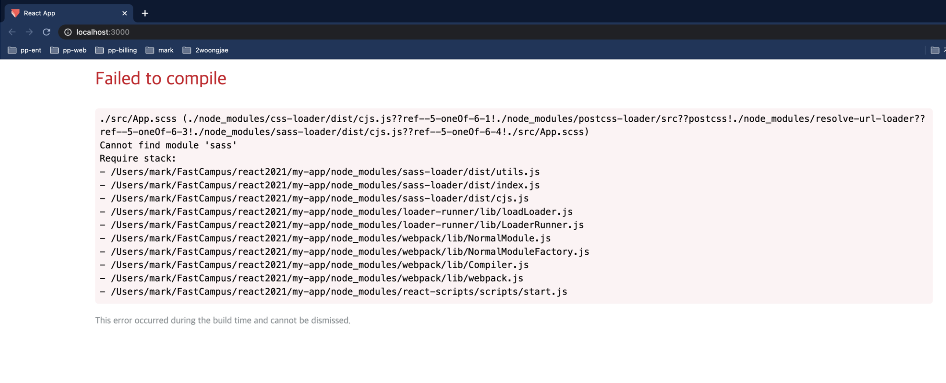
- SCSS를 적용한다고 하여서 바로 적용되는 것은 아니다.
- 아래의 package를 설치해야만, SCSS를 정상적으로 CSS로 컴파일 할 수 있다.
npm i sass
CSS Module, SCSS Module
- React는 CSS가 전역으로 작동하기 때문에, 코드가 오염되기 쉽다.
- 하지만 해당 오염을 막기 위해서 Module화 작업을 할 수 있게 도와주는 Package가 따로 있다.
import styles from './App.module.css';

console.log(styles);
App.js
.App {
  text-align: center;
}

.App-logo {
  height: 40vmin;
}

.App-header {
  background-color: #282c34;
  min-height: 100vh;
  display: flex;
  flex-direction: column;
  align-items: center;
  justify-content: center;
  font-size: calc(10px + 2vmin);
  color: white;
}

.App-link {
  color: #09d3ac;
}
App.module.css
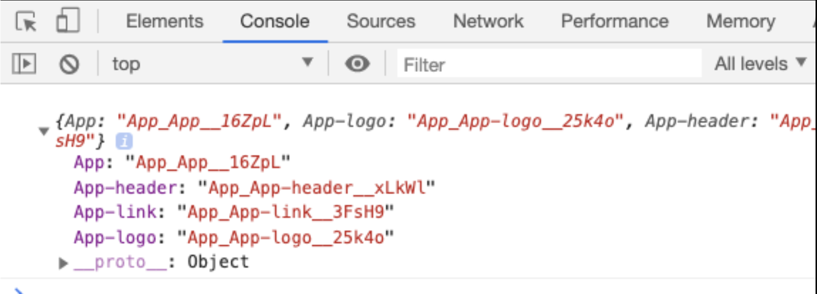
- 위와 같은 결과로 나오게 된다.
.App {
  text-align: center;
}
- 위의 결과가 위에 나오는
Object의 결과로 반영된 것이다. - 즉,
App: App_App_16ZpL이라는 값이 붙는 것이다.- 이유인 즉, React의 특성인 전역 CSS 변수를 Module화로 근본적으로 바꾼 것이 아닌 이름을 단순히 겹치지 않게 변경 시켜준 것 뿐이다.
- 그렇기 때문에 해당 방식을 사용하게 된다면, 일반적인 CSS를 불러오는 방법으로는 CSS를 당연히 인식 할 수 없게 된다.
- 그래서 아래의 방법으로 CSS를 불러와야한다.
import logo from "./logo.svg";
import styles from "./App.module.css";

const App = () => {
  console.log(styles);
  return (
    <div className={styles["App"]}>
      <header className={styles["App-header"]}>
        <img src={logo} className={styles["App-logo"]} alt="logo" />
        <p>
          Edit <code>src/App.js</code> and save to reload.
        </p>
        <a
          className={styles["App-link"]}
          href="https://reactjs.org"
          target="_blank"
          rel="noopener noreferrer"
        >
          Learn React
        </a>
      </header>
    </div>
  );
};

export default App;
App.jsx
Component 제작
.button {
  background: transparent;
  border-radius: 3px;
  border: 2px solid palevioletred;
  color: palevioletred;
  margin: 0 1em;
  padding: 0.25em 1em;
  font-size: 20px;
}

.loading {
  border: 2px solid grey;
  color: grey;
}
Button.module.css
import styles from './Button.module.css';

export default class Button extends React.Component {
  state = {
    loading: false,
  };

  startLoading = () => {
    console.log('start');
    this.setState({ loading: true });
    setTimeout(() => {
      this.setState({ loading: false });
    }, 1000);
  };

  render() {
    const { loading } = this.state;
    return (
      <button
        className={
          loading ? `${styles.button} ${styles.loading}` : styles.button
        } // class를 변경하기 위해서,, class를 두개 사용하기 위해서는 ` ` 해당 기호를 이용해서 한칸 띄고 사용하면 class를 두개 사용하는 효과를 낼 수 있다.
        {...this.props}
        onClick={this.startLoading}
      />
    );
  }
}
Button.jsx
className을 바꾸거나 혹은 ClassName을 두개를 사용하기 위해서
- className을 두개를 사용하기 위해서는 ``를 이용해서 사용이 가능하다.
- className을 바꾸기 위해서는 또한 삼한 연산자의 사용도 가능하다.
- 위의 코드를 보게 된다면, 너무 복잡하다
- 그렇기 때문에, className을 쉽게 사용할 수 있게 해주는 라이브러리가 있다.
npm i classnames
import classNames from 'classnames';

console.log(classNames('foo', 'bar')); // "foo bar"
console.log(classNames('foo', 'bar', 'baz')); // "foo bar baz"

console.log(classNames({ foo: true }, { bar: true })); // "foo bar"
console.log(classNames({ foo: true }, { bar: false })); // "foo"
console.log(classNames(null, false, 'bar', undefined, 0, 1, { baz: null }, '')); // "bar 1"
console.log(classNames(styles.button, styles.loading)); // Button_button__2Ce79 Button_loading__XEngF
classnames를 적용한 jsx
import styles from './Button.module.css';
import classNames from 'classnames';

export default class Button extends React.Component {
  state = {
    loading: false,
  };

  startLoading = () => {
    console.log('start');
    this.setState({ loading: true });
    setTimeout(() => {
      this.setState({ loading: false });
    }, 1000);
  };

  render() {
    const { loading } = this.state;
    return (
      <button
        className={classNames(style["button"],{
		    loading: this.state.loading,   // 해당 코드는 불가능하다.
        })}
        {...this.props}
        onClick={this.startLoading}
      />
    );
  }
}
Button.jsx
- 위의 코드는 불가능하다.
loading이라는 css를 불러 와야하지만, CSS Module의 특성상loading이라는 단순한 키가 아니기 때문이다.
- 그렇기 때문에 이를 해결하기 위해서는
classname/bind를 이용한다.
import styles from './Button.module.css';
import classNames from 'classnames/bind'; //bind 가져오기

const cx = classNames.bind(styles); // 변수 설정

export default class Button extends React.Component {
  state = {
    loading: false,
  };

  startLoading = () => {
    console.log('start');
    this.setState({ loading: true });
    setTimeout(() => {
      this.setState({ loading: false });
    }, 1000);
  };

  render() {

    const { loading } = this.state;

    return (
      <button
        className={cx('button', { loading })}
        {...this.props}
        onClick={this.startLoading}
      />
    );
  }
}
Styled Components #1
npx create-react-app styled-components-example

cd styled-components-example

npm i styled-components

code .

npm start
실습
src/components 디렉토리 생성 후에, src/components/StyledButtons.jsx 파일 생성\
import styled from 'styled-components';

const StyledButton = styled.button``;

export default StyledButton;
StyledComponents.jsx
import logo from './logo.svg';
import './App.css';
import StyledButton from './components/StyledButton';

function App() {
  return (
    <div className="App">
      <header className="App-header">
        <img src={logo} className="App-logo" alt="logo" />
        <p>
          <StyledButton>버튼</StyledButton>
        </p>
      </header>
    </div>
  );
}

export default App;
App.js
- 해당 코드를 돌리고, 개발자 도구를 확인하면 클래스를 지정하지 않아도, Class가 자동으로 지정되어 있다.
class = "sc-bdnxRM"로 현재 표기되어있을 것이며,sc는StyledComponents의 약자 입니다.
Styled Components#2
styled.<태그> 스타일
import styled from 'styled-components';

const StyledButton = styled.button`
  background: transparent;
  border-radius: 3px;
  border: 2px solid palevioletred;
  color: palevioletred;
  margin: 0 1em;
  padding: 0.25em 1em;
`;

export default StyledButton;
import StyledButton from './components/StyledButton';

function App() {
  return (
    <div className="App">
      <p>
        <StyledButton>버튼</StyledButton>
      </p>
    </div>
  );
}

export default App;
! 400
굳이 써야하나? 개 불편 해보이는데..
React Shadow
npx create-react-app react-shadow-example

cd react-shadow-example

npm i react-shadow

code .

npm start